The web world keeps evolving, earlier it was a desktop that connects the user with the websites, now we have devices like smartphones and tablets that bridge the gap between the virtual users and websites. Google, the giant search engine keeps expanding and experimenting with its algorithm in order to deliver better results and experience to its users and the latest announcement by Google regarding mobile first indexing has created a buzz in the SEO world. Before you get overwhelmed with this announcement, you must know that it is in its planning phase and Google will introduce it are steps. If you want your website to perform well even after the rollout of the mobile-first index, then here are few things that you must keep in mind for your website. Instead of hiring mobile SEO gurus for your website, first, learn how making your website ready for a mobile-first update.

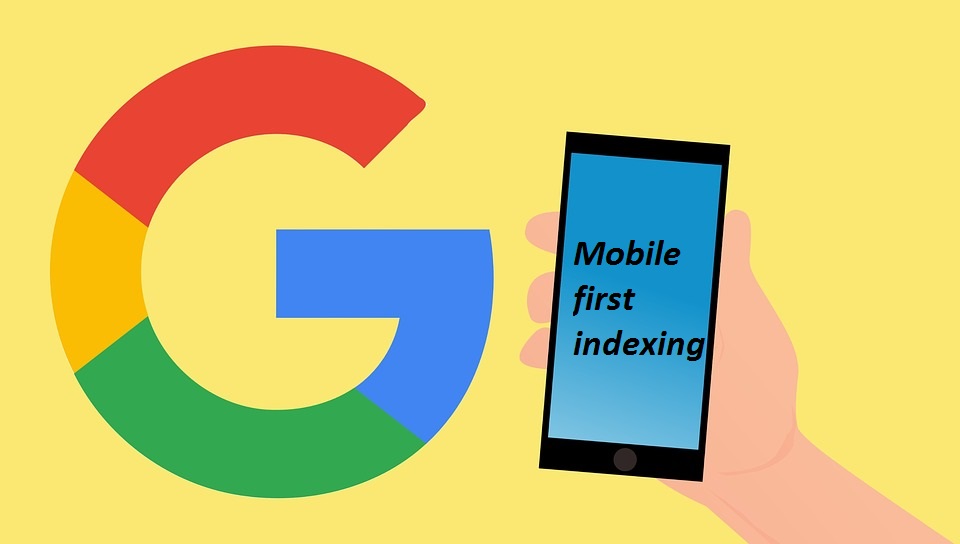
Why Mobile First Indexing?
Mobile indexing is in its experimental phase and it is not decided yet when it will be implemented completely, so this is a time when a website owner should do some homework to make their website more mobile friendly.
Enrich your website with content, even if it is designed for Smartphone and design the page that it shows all the relevant content even in smaller spaces.
As more and number of people are relying on the Smartphone for browsing and search results, now search engines are also paying attention to its user’s experience. The whole concept is designed with the vision to make websites more mobile friendly. To perform well in SERP now websites have to ensure that they are designed, developed and optimized for keeping mobile users into consideration and this change is for desktop results as well as for mobile results.
Here Mobile first refers to how Google will evaluate websites. The mobile version of the website will be considered as primary version and it will play a detrimental role in search engine ranking.
Make your website mobile friendly. Check your web pages from Google and find out how mobile friendly they are.
There are some other steps that would make your website more users friendly:
1. Responsive Web Design (RWD) – the best features of the responsive design is, it grows or shrink atom get fit into any screen size. If you have a responsive website, then you can make yourself safe in comparison to those who do not have responsive design.
2. Dynamic Serving – dynamic serving helps in delivering content based on the device type. This is done by employing user-agent detection, it identifies the type of system, it is on, and content is delivered accordingly.
3. Mobile-only Websites – Choose a web design service provider who can design a responsive website. When a user clicks desktop URL on their smart device they will be shown mobile web site. This type of system is ideal because it focuses on mobile users, which is what Google plans to do with their new search and indexing algorithms. Work with someone who offers responsive web design service and mobile friendly SEO service in India and makes your website ready for the mobile first trend.
 +91 95603 33661
 +91 95608 33232
 info@isglobalweb.com
 nikhil.wish
no comment